I recently took my son to see William Blake’s Universe, an exhibition at the Fitzwilliam Museum in Cambridge. It sets Blake alongside his contemporaries, and does a wonderful job of showing his journey from classically trained artist to something of an artistic revolutionary and, as he is so often labelled, a visionary. While many of his pieces on display are commissions, some of the most recognisable are his own compositions incorporating his poetry, in which each page is of his own design.

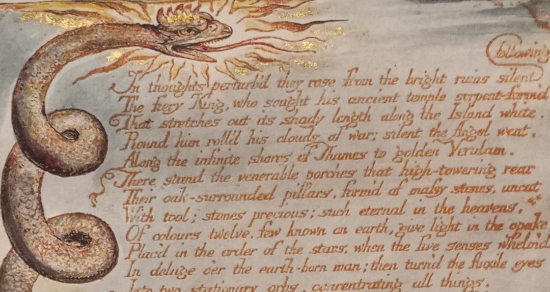
What is really striking about Blake’s collections of poetry is that each poem is itself a work of art that combines word and image. He called the works “illuminated books”, implicitly recalling the illumination of medieval manuscripts perhaps, although what he created combined artistic innovation and technology in a novel way.
In order to produce these elaborately coloured plates, Blake developed an innovative form of printing, a far cry from the industrial printing that had revolutionised the copying of texts through movable type in the preceding centuries. Rather than etching the design in intaglio on the copperplate (as might usually have been done with book illustrations), he etched it in relief and added coloured ink to these raised areas. This greatly improved the way ink could be added to the plates, and his works show a progression towards more intense and vibrant colours.

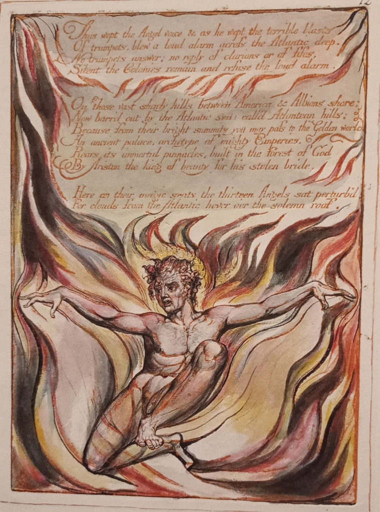
The whole composition had to be created all at once, which had serious ramifications for the artistic process. The words, as well as the images, had to be drawn and etched backwards, in order to appear correctly when printed. That came as a shock to me when I realised it – imagine having to write the whole text of a poem backwards, accurately and in such a way that the printed product would be aesthetically pleasing. For me this very much reinforces the impression of Blake as a multi-talented artist and poet. And it makes occasionally wonky lines of text or individual letters all the more forgiveable and even charming.
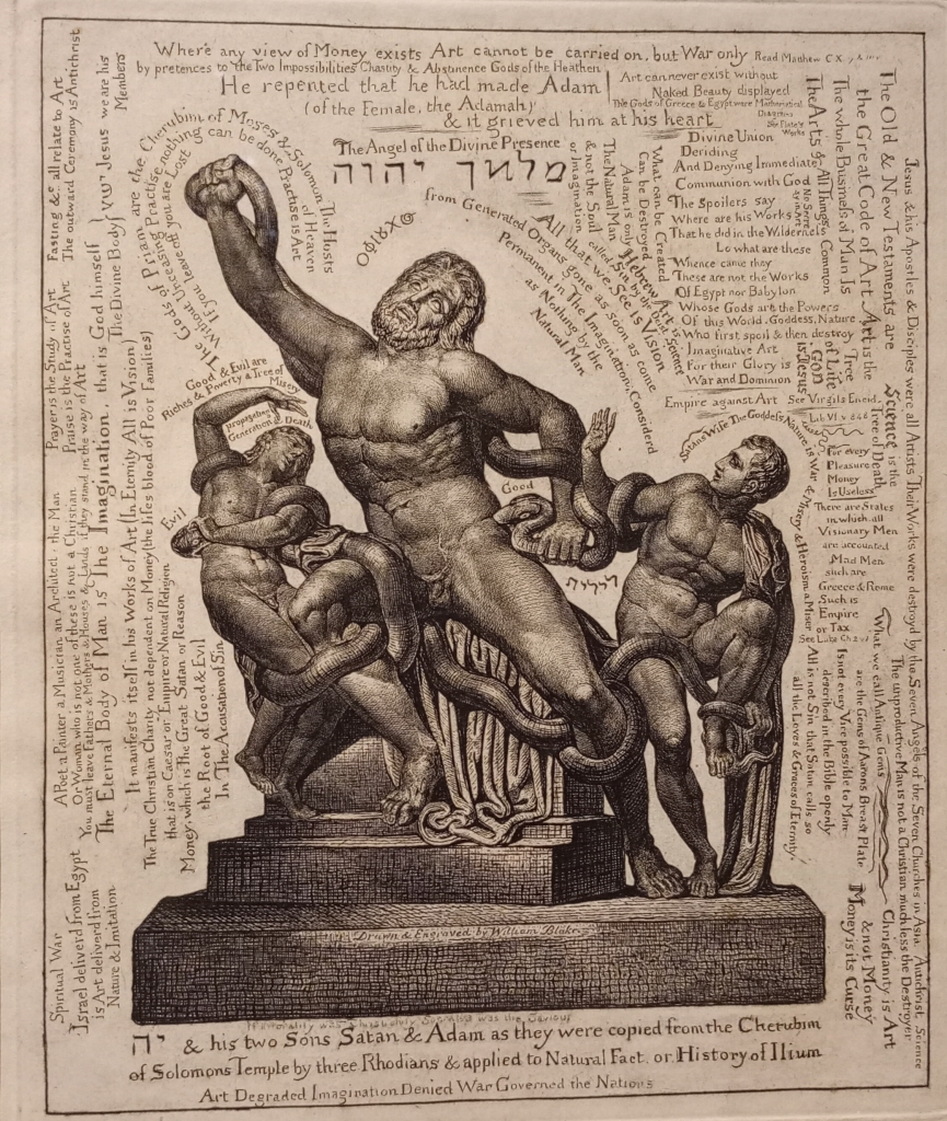
Although classically trained, like any artist of his time, Blake notably rejected the ideals of classical art, linking it with unappealing concepts of nationalism and materialism. His print On Homer’s Poetry is his most explicit condemnation of classical art, comparing it unfavourably with both Gothic and Christian art. Similarly his Laocoon claims that one of the most iconic of classical sculptures is in fact an inferior version of a biblical original. In this context, we occasionally see Hebrew text in his works, alongside his usual Roman script. This discussion of Blake’s Hebrew inscriptions (by Abraham Samuel Schiff) gives some insight into Blake’s competence in the language/script, as well as his interest in using it for visual and ideological effects.

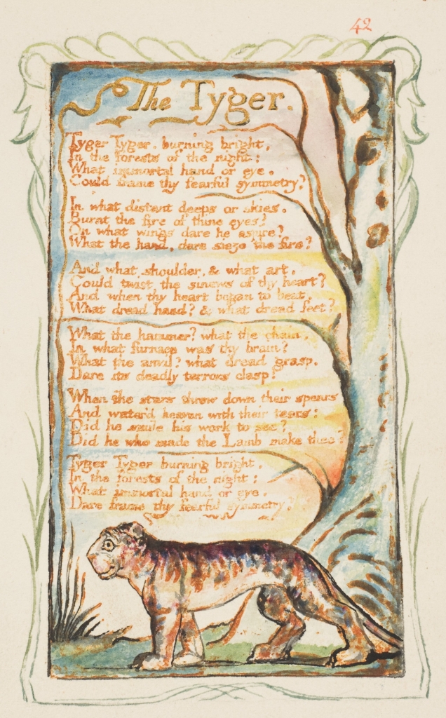
Blake’s developing views and preferences must have been significant as he designed his own way of using printing to achieve his artistic aims. His illuminated poems, which are both image and text at the same time as the words and pictures make space for each other, have become iconic cultural artefacts. It doesn’t quite feel right reading out the text of a poem like The Tyger, perhaps Blake’s most famous, or printing it in plain text, and robbing it of its intended visual context.
I very much enjoyed the exhibition, and especially the way it placed the emphasis on visual aspects of Blake’s creativity. Previously when I have encountered his work it has usually been his poetry in isolation, or his illustrations of other people’s written works. This exhibition made me appreciate him more as an individual, contextualised alongside his contemporary artists (some of whom were also innovating artistically), and as a creator for whom oral, visual and ideological aspects of art were all bound up with each other.
I recommend visiting if you can. There is a great deal I haven’t covered, and it’s on until 19th May 2024.
~ Pippa Steele (PI of the VIEWS project, currently on maternity leave)