VIEWS took part in this year’s Cambridge Festival, a showcase of research happening across the University of Cambridge. The project team has been together for several months now, and we’ve got our heads round one another’s ideas, specialisms, and plans, so the Festival was a great opportunity to introduce a broader audience to some of the key questions and themes that connect the various strands of VIEWS research.
Two of the postdoctoral Research Associates on the team, Philip Boyes and Jordan Miller, gave a talk titled Writing for display in the ancient world. The word ‘display’ is rather broad and was a good springboard for discussion. It can encompass communication, which most of us would intuit as the main purpose of writing—it’s by far the most common function of writing in the contemporary world. But what about writing that is technically visible, yet can’t really be seen? Philip and Jordan wanted to explore the interplay of visibility, readability, literacy, communication through language, and aesthetic expression.
Philip kicked off discussion with the Behistun inscription, a trilingual decree (Akkadian, Old Persian, Elamite) set up by the Achaemenid king Darius I high on a cliff face. Depending on lighting conditions, the text is hardly detectable—and virtually unreadable—from a vantage point on the ground, and getting high enough up the mountain to examine it more closely would have been quite a feat.

Much closer to the Cambridge home of VIEWS, the Admiralty Arch in London shows how such plays on readability, visibility, and literacy continue to be relevant. Its inscription is high above street level and is best viewed from the middle of the road (not the safest location!). It is written in Latin, a language that the vast majority of the population in this country cannot read. While Latin was more commonly taught when the Arch was built in 1910 (CE!), this would still have been true.

Although the inscription does communicate a message if you know how to read it, that message is arguably secondary to the ideological implications: the inscription, like the architecture, draws on the cultural associations of classical antiquity in the modern Western world. It’s in Latin, and together with its typeface, it evokes the authority and prestige of ancient Rome. The average educated passer-by might be expected to recognise the royal names Edward and Victoria, but even those aren’t really necessary to understand what the monument is ‘actually saying’—that this is an imperial capital in the vein of ancient Rome; that this is a place of political and cultural power. Viewers would recognise this style from countless public buildings all over Europe. They don’t need to be able to read the text to get the message. It has an inscription because having Latin inscriptions like this is part of this visual language of power, not because it needs to be read.
The Behistun inscription and Admiralty Arch raise issues of accessibility, but what about inscriptions that were well-sized and in easy reach of literate audiences, possibly even ‘the public’? How far were they actually read, and what do we mean by ‘reading’ anyway? The Gortyn code from Crete (5th century BCE) is a good example of this.

The Gortyn code was part of a long tradition of public legal displays going as far back as the Code of Hammurabi in Mesopotamia (18th century BCE) and the royal decrees of Old Kingdom Egypt (24th–21st centuries BCE). Even if these inscriptions were accessible, how many people were actually interested in reading them? The presence of a text can sometimes be more important than its content. Jordan wonders if the text of Hammurabi’s code might really be considered a kind of extended caption to the famous scene at the top of the stela bearing the text, of king Hammurabi interacting with Shamash, the sun-god and dispenser of justice—there are parallels for this kind of setup in ancient Egypt, for example the famous ‘king as sun-priest’ text which in its earliest monumental representations (mid-second millennium BCE) links the figures of the king and sun-god.
Viewers may have been able to recognize common words or phrases—and this need not have depended on actual linguistic ‘reading’ in the sense of deciphering signs and parsing grammar, but on recognizing common graphic clusters. Thoroughgoing readings may not have been the primary expectation. Yet, the impact of display may have depended on the very presence of extensive text, which produced a visual spectacle of diverse sign forms and/or sequences (depending on the character of the script, whether alphabetic, cuneiform, hieroglyphic, or otherwise). Literacy, communication, and display exist in complex relationships.
However, there are many examples of inscriptions that seem to have been deliberately concealed, or at least never intended to be read. Why did the sarcophagus of the Phoenician king Ahiram at Byblos (c. 1000 BCE) feature a curse inscription against grave robbers? To even reach the sarcophagus and read that curse, robbers would already have tunnelled through rock and clay into a cramped, dark, 10m-deep vertical shaft! It’s unlikely they would have given up at that point!

One way of thinking about such inscriptions is as voice, just as images could be bodies. Also part of the Near Eastern traditions of curses are the extensive warnings to potential vandals inscribed on the monuments of Mesopotamian kings, who refer to their inscriptions and images as if they were extensions of their physical selves, enduring into eternity. Destruction of text and image will be met by the extermination of lineages, legacies, and offices. The counterpart to such injunctions is the practice of damnatio memoriae, well known from many ancient cultures, from Egypt to Rome.
We then moved discussion onto Egypt, where practices of hieroglyphic writing were strongly motivated by aesthetics. On the one hand, writing itself was often mobilized for its aesthetic value, as on offering tables and false doors with symmetrical columns of text and writing that may expand outward or converge at central points. Certain monuments seem to have been modelled as readable glyphs in themselves, for example the altar in the sun temple complex of the king Niuserre (c. 2450 BCE).

The altar, which would have bore offerings to the sun-god, is fashioned as four hetep-signs reading ‘offering’ and in the form of a tray carrying a loaf of bread, surrounding a central disc—the sun, the recipient of those offerings. What do we mean by ‘literacy’ in such contexts, where actual objects placed on the altar mirrored the depictions of them that served to write out ‘offering’?
On the other hand, visual spectacle could enhance the expression of language. The famous ‘crossword stela’ dedicated to the goddess Mut by an Egyptian official called Paser, is a flat slab inscribed with what could be called a ‘triple hymn’ to the goddess. It makes visible the rectangular ‘quadrats’ into which hieroglyphic signs are grouped. The quadrats form a dense grid that can be read either vertically or horizontally, the resulting texts being hymns to Mut.

The ‘crossword’ designation is a misnomer: Egyptian quadrats could have one or several signs, so a quadrat could serve as a whole word, or as a series of phonetic signs in a word spanning more than one quadrat. And so the signs could play different functions depending on the direction of reading. In such contexts, literacy was key to fuller aesthetic appreciation. Moreover, the header on the slab states that the monument can be read in three ways, and the elusive third option is likely represented by the frieze of deities along its top edge. Such ‘ornamental cryptography’, as it is often called, write out the names and epithets of kings and gods through atypically-scaled, unusually-formed images that seem more at home as ‘iconography’, yet can be read as text.
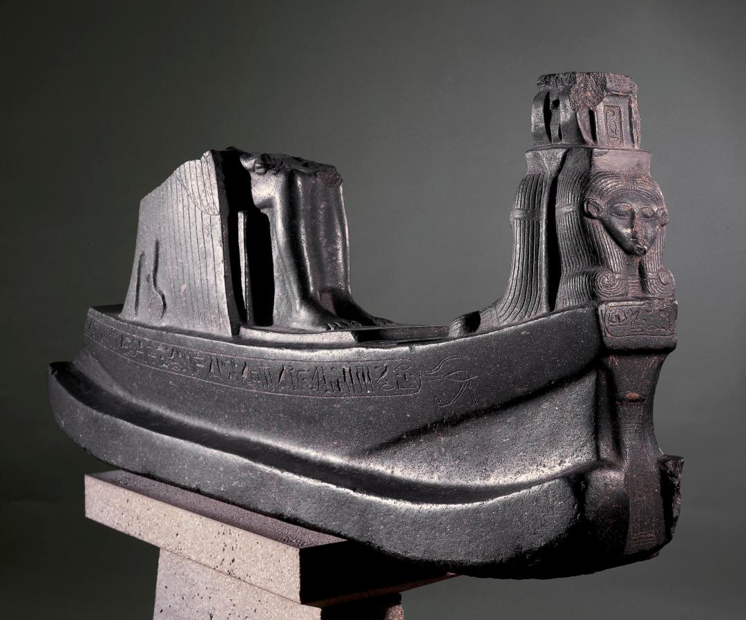
And if the curse inscriptions of the Near East extend the self into monuments through the vocalic potential of writing, some ancient Egyptians took the idea to its logical extreme by crafting the self through monuments. One of the best examples of this is a monument dedicated to Mutemwia, a wife of king Thutmose IV and mother of king Amenhotep III (c. 1400 BCE). A massive granodiorite barque bearing a figure of the goddess Mut was dedicated to Mutemwia in the temple at Karnak, where Mut was consort to the patron deity Amun. Thus the monument writes out the name of Mutemwia herself, ‘Mut is in the barque’ (mut-em-wia).

The forms of works such as this one were appropriate for temple contexts, and they negotiated truly intimate links between deity and beneficiary, where each was an inseparable part of the other. Writing was display, display was presence; and in terms of communication, one could ‘get the message’ by ‘reading’ the image even if one could not ‘read’ conventional linear texts.
We were delighted to be able to share this material with Festival audiences, and came away with some really interesting ideas from attendees with knowledge of all sorts of other scripts and languages. Philip and Jordan are exploring these topics and case studies in more detail as part of their VIEWS research, so stay tuned for updates in the form of articles and their eventual monographs!
– Jordan Miller, VIEWS Research Associate
